

Throwback Project: Interior Transformation for Five Boroughs Brewing Co.
Posted Nov 07, 2019 by Dave Scaturro
Five Boroughs Brewing Co. is a new company looking to enter the craft beer industry. This start-up hopes to produce several varieties of unique craft beer that will be loved by all New Yorkers and beyond. They want their beer to represent a sense of community and culture that embodies the five boroughs of New York City. To start, Five Boroughs Brewing Co. is planning to open up their brewery in the heart of Brooklyn, New York in early 2017.
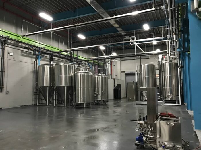
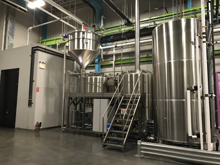
In August of 2016, Alpine Painting & Sandblasting contractors submitted a bid to help transform the interior of an old steel fabrication shop into a custom craft brewery. Five Boroughs Brewing Co. needed Alpine to paint three separate spaces, which included the Production room, the Storage room, and the Taproom. The total floor area is approximately 15,000 square feet and the ceiling measured around 33 feet tall. The production room, the largest of the three spaces, contains a large overhead Crane, steel archways/columns, upper/lower gantry horizontal wall steel and sprinkler piping/conduit throughout the facility. The storage room includes sheet rock/block walls, newly constructed offices & lab rooms, wood ceiling, sprinkler piping, and structural steel. The Taproom, which is the highlight of the space, includes a custom bar, four bathrooms, wooden ceiling, overhead crane & cab, overhead & man doors, steel supports & sprinkler pipes.

Prior to selecting Alpine to take on the job, they were able to meet with the customer and walk the property. At that time the owner had an overall idea for the look of their new facility, but was open to recommendations as far as surface preparation, coating selection and color placement. Blake Tomnitz and Kevin O’Donnell, Co-Founders of Five Boroughs Brewing Co.d, had a vision of adding color into their dark industrial space. Not just any color, but electric colors. They were very specific during our initial walk-through of how they wanted the space to look and feel when an employee or customer walked through the doors. The majority of the wood truss ceilings and & brick/block walls were painted with a medium gray color and the heavy bulk steel was highlighted with one of five bright colors to make them jump off the mild grey backdrop. The color wasn’t the only thing that made the area pop, but the consistency and positioning of each color created a unique look that captured your attention.
![]()
The inspiration for their paint color choices came from the unique packaging and marketing materials built into their brand. Alpine was asked to match a series of Pantone (PMS) Colors with our paint. Alpine initially provided a drawdown of each color, supplied by Sherwin Williams. After Alpine recognized how vibrant the color selections Alpine encouraged the owner to allow our team to complete multiple field color roll-outs to help determine the coverage of each color. Sherwin Williams worked closely with our team to choose the right Color-Prime Colors to deliver the best coverage of each topcoat. Shades of White to Gray were used under each topcoat color to maximize the finished look. Some colors required two finish coats where others needed three or more.
One hurdle to overcome was following behind a general contractor who had previously primed various areas of the facility. Unfortunately, the GC did not apply the appropriate primer for some of the substrates Alpine was to topcoat. This became a concern as to the integrity of the previous contractor’s surface preparation and the poor choice in product application. Without knowing if the previously applied coating will hold back the rust from the metal beams, Alpine presented the customer with several options to move forward and paint their steel. The note on our proposal read as follows: